


Fri, 11 Aug 2006
Lake Wobegon School District
As parents of elementary school-age children, we receive annual reports on their STAR ("Standardized Testing and Reporting") scores. One of today's reports came in the mail, and guess what I noticed?
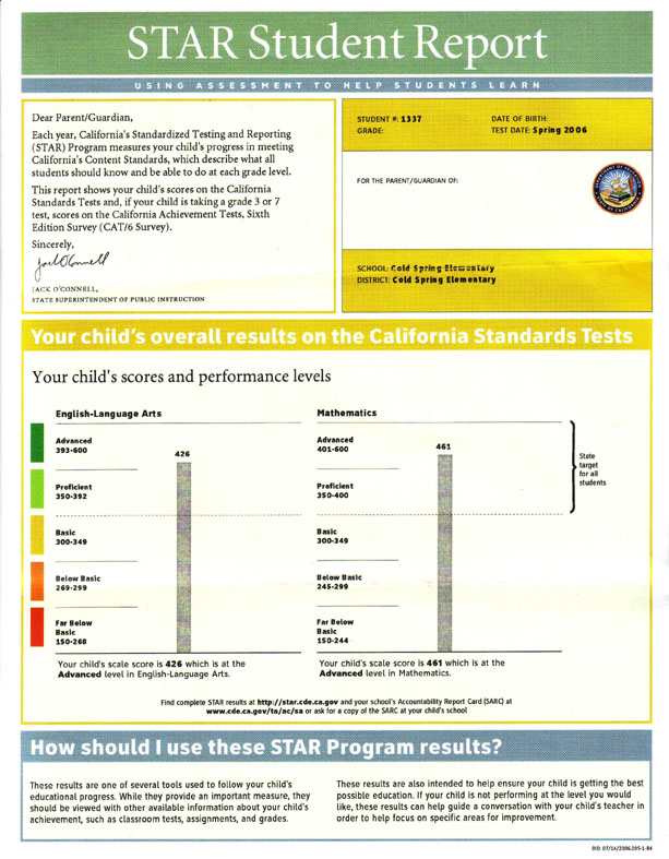
The centerpiece of the report is a graph of my child's performance compared to the state standards. Take a look:
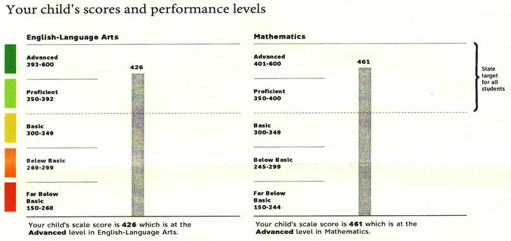
Pretty good! However, as I studied the numbers I noticed that they aren't even 20% intervals. Every range is different from every other.
So what? So look what happens when I go into Photoshop and produce a graph where the distances are actually consistent the way you would expect them to be on a graph:
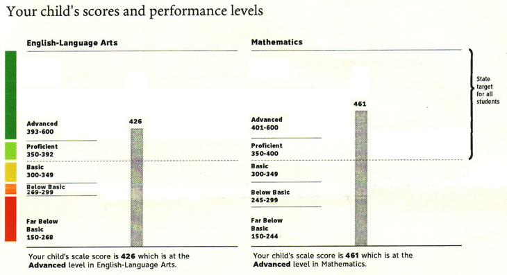
Not nearly so impressive, is it?
Look at what happened to the dotted line. The state target just got a lot lower: 350 on a scale from 150-600 is 44% of the way up to the top, not 60% as in the first graph. Welcome to California, where below grade level is above average.
And look at what happened to my high-performing child. Still good, but not nearly as solid as it had appeared. Suddenly I see a lot more room for improvement, both on our family's part and on the part of the school. And 'Advanced' doesn't look nearly as advanced as before.
What if I had a child right between the yellow and orange levels? The report would suggest that he or she needed to do a little extra work but that things weren't that bad. Below the state's goal for our schools, to be sure but hey, that dotted line is above the half-way point, so maybe I just have an average student and the state is being a little too ambitious. Is that how it would look if the score were only one-third of the way up the page?
This graph is by far the most prominent information on the whole page. The other side has monochrome fine print and compressed percentile statistics on components of the test, and those aren't distorted. But the image of a high-performing student and an ambitious school system is already burned into my imagination. How would I be reading them differently if I saw this first page instead?
Now the graph doesn't have to be linear to be truthful. It could use a bell curve, since the test results probably fall along one. It could use true quintiles or uneven ranges as in my Photoshopped version. But the graph isn't any of these. The total range for California STAR tests is 600-150, or 450 points. A quintile should have a range of 90 points. But the bottom (red) 'quintile' has a range of 119, or 26%. The next (orange) has a range of 31 (6%) on the left and 55 (12%) on the right. The 'middle' (yellow) has a range of 50 (11%). The penultimate (light green), corresponding to grade-level performance, has a range of 43 (9%) on the left and 51 (11%) on the right. The top (dark green), corresponding to above-grade-level performance, has by far the largest range: 208 (46%) on the left and 200 (44%) on the right.
There seems to be no rhyme or reason to the numbers, but of course there is. The chart is laid out to make the state, my school, my child, and my child's teachers all look better than they are.
Here is a larger roll-over image to help you compare the two directly.
I am a teacher too. In my circles we call this "misrepresenting the data," otherwise known as cheating.
Perhaps the ranges really need to be different. Then don't graph them! Or don't use a smooth gray bar from the bottom to where my child's scores are. Or ask the statistians that designed the testing scheme in the first place. Surely they can figure something out. But whatever you do, tell me the truth about my own child, not just in the fine print but in the headline.
My advice to California State Superintendent of Public Instruction Jack O'Connell: Next year, find someone who passed elementary school pre-algebra to do your advertising for you.
Update: I sent a link to EduWonk, who kindly responded by directing me to this article on how scores are set on these tests. I did further digging to discover that the numbers on California STAR reports are scaled but not normed, so they need not produce a normal distribution. Everything I have read indicates that those five areas are not quintiles. Graphing them as such is misleading.
21:47 (file under /topics/life)
Thu, 10 Aug 2006
Snap Out of It!
Hearty, sincere thanks to whichever intelligence and law enforcement people saved the lives of hundreds (thousands?) of air travelers by busting the latest Islamist plot today.
Thanks also to the Anchoress for talking more sensibly than many whose sites I've visited since the story broke:
How about for the day, and for the immediate days before us, some of us drop the agendas, drop the cynicism, drop the paranoid theories, drop the conspiracy theories, drop the profound generalizations, drop the hate and drop the idea that what we are dealing with is easy, simple or uncomplicated, or that its solution may be found in the promotion or demotion of a man in Washington or a man in Britain (If only they would listen to you!)
And how about we Christians stay focused on the shepherd who is the solution we have to offer the world? Remember him?
17:21 (file under /topics/wot)
Mon, 07 Aug 2006
Fall 2006 Syllabi
A few eager-beaver students are asking about next semester's syllabi. I am sure it is because they love learning and not just that they want to pick up deals on amazon.com. At any rate, I have finalized my textbook choices for next semester's classes. There are more than ever! Woo-hoo!
Here are my booklists for Christian Doctrine and Doctrine of Reconciliation. I encourage parents and others who want to purchase copies so you can read along. Doctrine students: Note that there is an in-course honors track for those of you who are eligible. It has some of the same readings and some different ones. A new aspect to the course will be one text that you will choose from a list to read with other students.
Alas, if you want to read ahead you will have to wait until I post the reading schedules. Those will be 'under construction' until nearly the beginning of the semester.
22:30 (file under /topics/westmont/classes)
